

DC Logo: Evolution, Revolution, and the Quest for Identity
Introduction
Ever catch yourself staring at a logo and wondering, “What’s the story behind that?” Logos aren’t just pretty pictures; they’re silent storytellers, visual shorthand for a brand’s entire identity. And when it comes to iconic logos, the one representing DC Comics is a fascinating case study of evolution, revolution, and the ongoing quest to capture the essence of a universe filled with superheroes and supervillains.
Think about it: The DC logo has graced comic books, blockbuster movies, and animated series for decades. It’s a symbol instantly recognizable around the world. But its journey hasn’t been a straight line. It’s been a rollercoaster of tweaks, redesigns, and even outright identity crises. So, buckle up, Batfans and Super-friends, because we’re diving deep into the fascinating evolution of the DC logo.
A History Etched in Ink
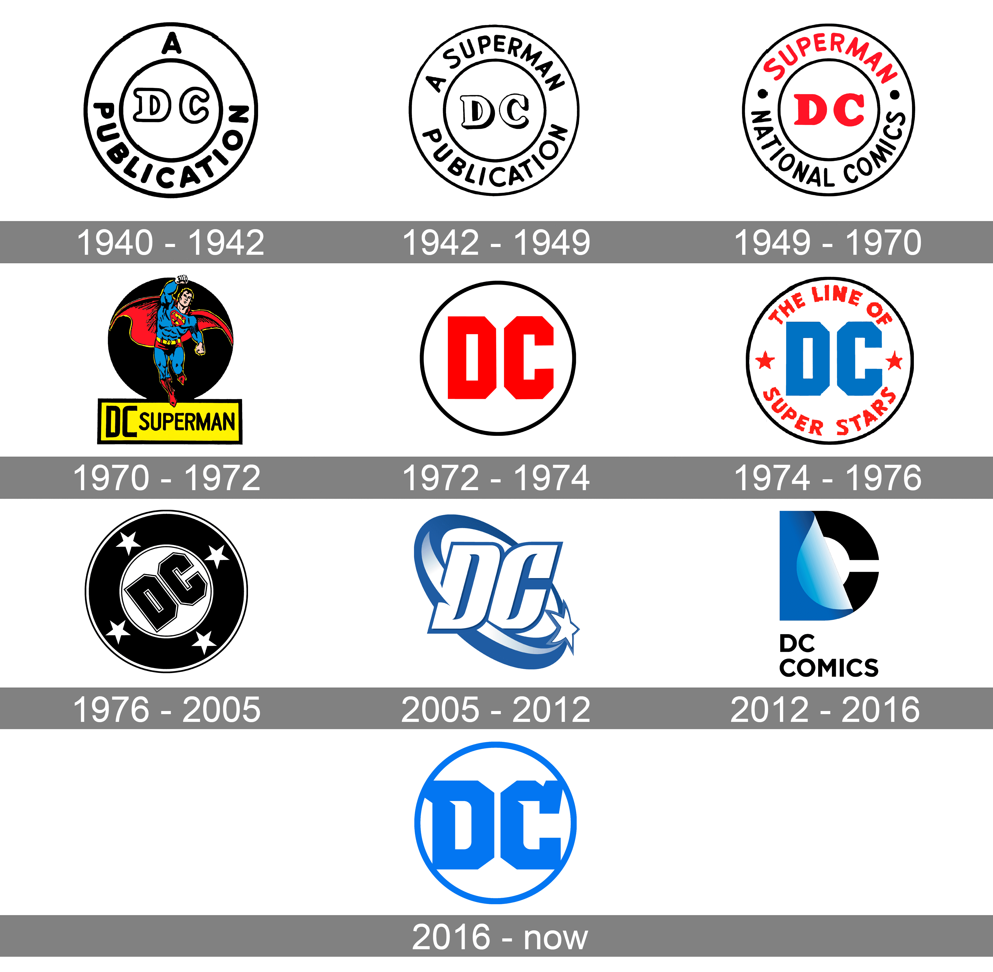
The early days of DC, back when it was called National Allied Publications (phew, thankful for the name change!), saw a logo that was…well, functional. It did the job, identifying the publisher, but it lacked the pizzazz we’d expect from the home of Superman and Batman. Think simple text, not dynamic design.
Fast forward to the golden age of comics, and the logo began to evolve. The “DC” initials started appearing, often nestled within a larger symbol or incorporated into the comic book cover art. This was the beginning of the brand’s visual identity taking shape, but it still lacked a definitive, unifying mark.
Then came the iconic “DC Bullet” logo. This design, featuring the “DC” initials inside a stylized bullet shape, reigned supreme for decades. It was clean, bold, and instantly recognizable. It screamed “comics!” and became synonymous with DC’s stable of heroes.
But even icons can’t stay the same forever. The late 20th and early 21st centuries saw a series of redesigns, some more successful than others. We saw the “DC” initials enclosed in a square, then a rotating page design that hinted at the storytelling within. These changes reflected the changing landscape of the comic book industry and DC’s attempts to stay relevant in a visually saturated world.
Then came the controversial “peel” logo in 2012. The concept was intriguing: the “DC” initials appearing to be peeled away to reveal a hidden symbol or image underneath, representing the layered storytelling and interconnected universe. However, it was met with mixed reactions. Some found it modern and innovative; others felt it was clunky and obscured the brand identity.
Finally, in 2016, DC landed on its current logo: a sleek, minimalist design featuring the “DC” initials in a bold, contemporary typeface. This logo emphasizes simplicity, clarity, and a sense of forward momentum. It reflects a renewed focus on the core essence of the DC brand.
The Ripple Effect: Short-Term and Long-Term Impacts
Why all this fuss over a logo? Because a company’s logo has significant impact, both short-term and long-term. A poorly conceived or executed logo can lead to:
- Short-Term Confusion: Think about that “peel” logo. It generated a lot of discussion, but also a lot of confusion. Was it a “D” and a “C”? Was it peeling away from something? This confusion impacted brand recognition, making it harder for consumers to quickly identify DC products. Sales can suffer when a logo is perceived as outdated, unprofessional, or simply confusing.
- Long-Term Erosion of Brand Identity: Constant logo changes can dilute a brand’s identity over time. If consumers can’t consistently associate a specific visual with a brand, they may feel less connected to it. This can lead to a loss of brand loyalty and a decline in market share. Imagine if Coca-Cola changed its logo every few years – it would likely damage its iconic status and hurt its bottom line.
- Damage to Brand Equity: A strong logo contributes to brand equity, the value a company derives from its brand name and image. A weak or inconsistent logo diminishes this value, making it harder to attract new customers and retain existing ones.
Conversely, a well-designed and consistently implemented logo can:
- Enhance Brand Recognition: A clear, memorable logo makes it easier for consumers to recognize and remember a brand. Think of the Nike swoosh – instantly recognizable worldwide.
- Strengthen Brand Loyalty: A logo that resonates with consumers on an emotional level can foster a sense of brand loyalty. Think of the Apple logo – it represents innovation, quality, and a certain lifestyle.
- Boost Brand Equity: A strong logo enhances brand equity, making a company more valuable and competitive in the marketplace.
Navigating the Design Landscape: Practical Solutions for Logo Design
So, what can DC (or any company) do to ensure its logo effectively represents its brand and achieves its business objectives? Here are some practical solutions:
- Understand Your Brand Identity: Before even thinking about design, clearly define your brand’s values, mission, and target audience. What makes your brand unique? What do you want your logo to communicate? For DC, this means balancing the legacy of classic characters with the need to appeal to modern audiences.
- Simplicity is Key: A complex logo can be confusing and difficult to reproduce effectively across different platforms. Aim for a clean, minimalist design that is easy to understand and remember. Think of the Nike swoosh or the Apple logo – simple, yet iconic.
- Consider the Color Palette: Color plays a crucial role in logo design. Different colors evoke different emotions and associations. Choose colors that align with your brand’s identity and target audience. DC’s use of bold, primary colors has traditionally been associated with its superhero genre.
- Test and Iterate: Before launching a new logo, test it with different audiences to gather feedback. Conduct surveys, focus groups, or A/B tests to gauge its effectiveness and identify areas for improvement. The “peel” logo perhaps could have benefited from more extensive testing and iteration.
- Maintain Consistency: Once you have a logo you’re happy with, use it consistently across all platforms. This includes your website, social media channels, marketing materials, and product packaging. Consistency is key to building brand recognition and loyalty.
- Consider the Long-Term Implications: A logo should be designed to withstand the test of time. Avoid fleeting trends and opt for a timeless design that will remain relevant for years to come. This doesn’t mean you can’t make updates or tweaks, but avoid radical redesigns that could confuse your audience.
Alternative Approaches: Tailoring Solutions to Fit
Different brands require different approaches to logo design. Here are a few alternative strategies to consider:
- The Evolutionary Approach: Instead of a complete overhaul, gradually evolve your existing logo over time. This allows you to stay current without alienating your loyal customers. Think of how Google has gradually refined its logo over the years, maintaining its core identity while keeping it fresh and modern.
- The Modular Approach: Develop a modular logo system that allows you to adapt the logo for different contexts and applications. This can be particularly useful for brands with diverse product lines or target audiences.
- The Community-Driven Approach: Involve your community in the logo design process. This can generate excitement and build brand loyalty. Consider running a logo design contest or soliciting feedback from your customers on different design options.
The Future is Bright: A Call to Action
The journey of the DC logo is a testament to the power of visual identity and the importance of adapting to a changing world. Whether you’re a comic book publisher, a startup, or an established corporation, your logo is a critical asset that deserves careful attention.
So, take a closer look at your own logo. Does it accurately reflect your brand’s identity? Does it resonate with your target audience? If not, now is the time to take action. By understanding the principles of effective logo design and implementing practical solutions, you can create a logo that not only looks great but also strengthens your brand and drives business success.
The future of your brand is in your hands. Embrace the challenge, be bold, and let your logo tell your story. It’s time to embark on your own quest for identity and create a visual representation that truly captures the essence of your brand. The possibilities are endless, so go out there and make your mark on the world!
